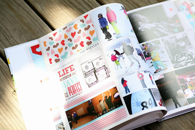
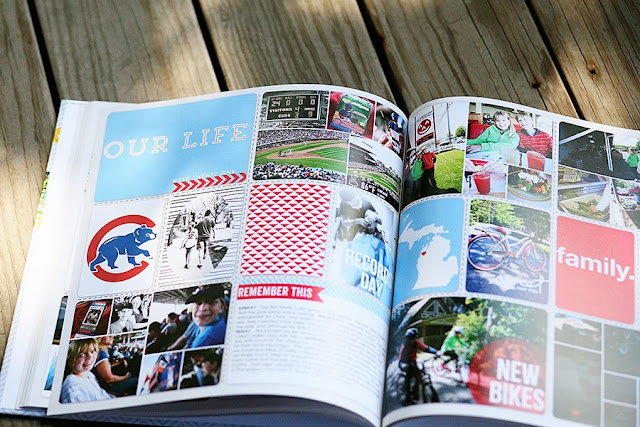
Okay... here it is! My book for the first half of 2013!! I am really, truly in love with this book and love to look through it over and over. There are some things I already know I want to do differently next year, and there are some typos I missed that kill me a little every time I see them (but now I know where they are and don't look at them any more... lol!)... but to say that I'm pleased with how my first book of my first year of Project Life turned out is a definite understatement!
I printed mine as a 12x12 book through Shutterfly...
I used a template by Emily Merritt from The Lilypad to make the cover. I plan on using the exact same thing on book 2, just switching out the photos. My one beef I have with my cover, is that I forgot to put book 1 on the spine! It just says Project Life 2013. I'm going to label book 2 on the spine, but it's going to bug me a little that they don't match completely.
Cover page...
I'll be honest, I didn't put much thought into this. I had a Shutterfly coupon that was about to expire that night so I threw some things together (Cathy Z freebies) and made the cover page. Haven't come up with a plan on the book 2 cover page yet.
The inside pages...
Please ignore the glares and blown out areas. That's not the printing, it's the lighting I had on my deck when I took these photos. Everything printed beautifully!! I really couldn't have been more pleased! I use my phone a LOT for PL and I was a little leery about how those photos would print, but they printed great. So did my phone screen shots and images I grabbed from the web.
I mentioned this summer how excited I was that my son's camp allowed free downloading of the photos they took everyday. Those printed great as well...
... and I was so thrilled to be able to include him in our weekly pages even when he wasn't with us!
And lastly, my oh so exciting last page of the book...
I can't believe that I'll be starting to put together week 43 tomorrow!! First I'm having a hard time accepting that the year is almost over already and second, I'm very surprised that I've managed to keep the momentum going on this! In fact, there's so much momentum that next year's planning has begun (I just need to find a way to take a small break between the 2013 book and the 2014 one without getting too far behind).


It looks terrific! I love it! Too bad about that typos. I added some QR codes to a few of my pages this year, and as I was looking through my book, I noticed that I left one out! Totally has a blank space with an arrow pointing to it saying to scan it and watch. Doh! :)
ReplyDeleteWhat did you do for the spine design? I used the same background paper as my cover, and there is this pesky dark line where the cover design ends and the spine design begins. Does yours have that?
Oh no Jenny! That's too bad! I've been meaning to try the QR code thing but haven't yet.
ReplyDeleteI will admit that I probably didn't try hard enough, but I couldn't get my custom spine to add to my book properly. So, I ended up just using a Shutterfly spine that coordinated with my colors. I looked at mine closely and I don't notice a dark line where they meet (thought it could have been a digital shadow they include for dimension, but i don't see anything).